
Remember when having a “mobile-friendly” website was enough? Those days are long gone. In today’s digital landscape, where mobile devices account for a significant and often majority percentage of web traffic, simply adapting your desktop website for mobile is no longer sufficient.
You need to be thinking mobile-first.
What does that mean? It means designing and developing your website with mobile devices as the primary focus, and then scaling up for larger screens. It’s a fundamental shift in perspective that can have a dramatic impact on your user experience, conversion rates, and overall business success.
If you’re not embracing a mobile-first approach, you’re potentially missing out on a huge segment of your target audience and leaving money on the table.
1. What is Mobile-First Design?
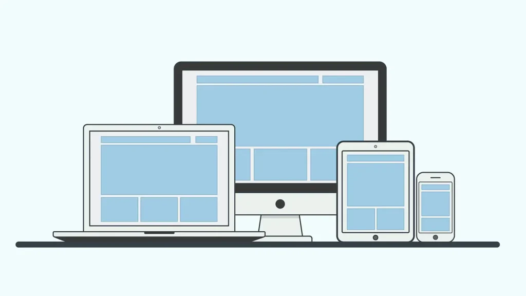
Mobile-first design is a web design approach where you prioritise the mobile experience. Instead of starting with the desktop version of your website and then adapting it for mobile devices (a method known as responsive design), you start with the mobile version and then progressively enhance it for larger screens.
Think of it this way: you’re designing for the smallest screen first, ensuring a seamless and intuitive experience for mobile users. Then, you add more features and complexity as the screen size increases.
2. Why Mobile-First Matters:
Here’s why a mobile-first approach is essential for your business:
- Mobile Traffic Dominance: Mobile devices account for a significant and often majority percentage of global web traffic. Ignoring mobile users means ignoring a large segment of your potential customer base.
- Improved User Experience: Mobile-first design forces you to simplify your content and prioritise the most important elements. This leads to a cleaner, more focused user experience on all devices.
- Faster Loading Times: Mobile-first design encourages you to optimise your website for performance, resulting in faster loading times on all devices.
- Better SEO: Google prioritises mobile-friendly websites in its search results. A mobile-first website is more likely to rank higher, leading to more organic traffic.
- Future-Proofing: With the increasing popularity of mobile devices and the emergence of new screen sizes, a mobile-first approach ensures that your website is ready for the future.
3. Key Principles of Mobile-First Design:
Here are some key principles to keep in mind when implementing a mobile-first design:
- Prioritise Content: Identify the most important content on each page and make sure it’s prominently displayed on mobile devices.
- Example: Use a single-column layout to ensure that content is easy to read on small screens.
- Simplify Navigation: Use a simple and intuitive navigation menu that’s easy to use on touchscreens.
- Example: Use a hamburger menu (three horizontal lines) to collapse the navigation menu on mobile devices.
- Optimise Images and Videos: Compress your images and videos to reduce their file size and ensure they load quickly on mobile devices.
- Example: Use responsive images that automatically scale to fit the screen size.
- Use Touch-Friendly Design Elements: Make sure that all interactive elements on your website (such as buttons, links, and form fields) are large enough and spaced far enough apart to be easily tapped on touchscreens.
- Example: Use larger buttons with clear labels.
Is Your Website Just Mobile-Friendly… Or Mobile-Awesome?
Don’t settle for a website that’s merely mobile-friendly. Embrace a mobile-first approach and create a website that’s truly optimised for the way people browse the web today.
Here is the recap:
- Prioritise Content
- Simplify Navigation
- Optimise Images and Videos
- Use Touch-Friendly Design Elements
Ready to take your website to the next level with a mobile-first design? Get in touch with us today for a free mobile strategy consultation! We’ll analyse your website, identify areas for improvement, and develop a customised mobile strategy to help you achieve your business goals.